The Project
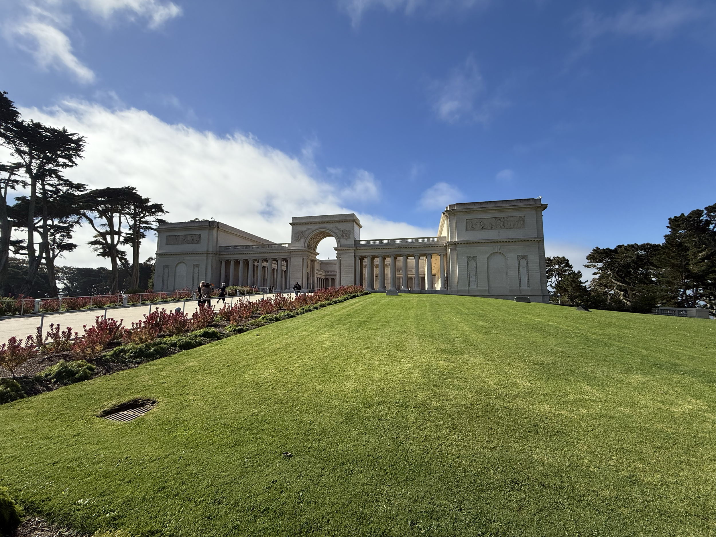
Our project focuses on redesigning the wayfinding and informational system of the Legion of Honor museum in San Francisco, aiming to align it with a cohesive visual identity that reflects its rich European art heritage. Nestled atop Lincoln Park with sweeping views of the Golden Gate Bridge, the Legion of Honor is a neoclassical masterpiece that houses an extensive collection of European paintings, sculptures, and decorative arts. The museum's mission is to inspire and educate visitors through art, forging connections to European traditions and history that span centuries.
The outcomes of this project will be innovative and visitor-centric, enhancing navigation while harmonizing with the museum's architectural grandeur. By integrating modern design principles while respecting the museum's historic essence, we strive to create an experience that is both seamless and memorable for its diverse audience.




Challenges
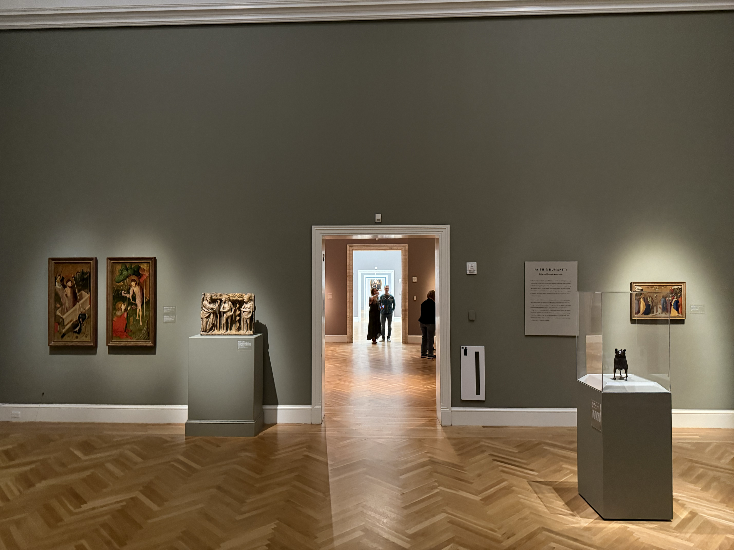
First-time visitors usually struggle to find their way around the Legion of Honor because of its complicated layout and old signs. The unclear directions and lack of a digital navigation tool can lessen the visitor experience. Our team is considering, “How can we make navigation easier in the museum?” and “How can we engage visitors to ensure they have a memorable and educational visit?”
Project Statement
Our team intends to enhance the visitor experience at the Legion of Honor by developing an intuitive wayfinding system that respects the museum's architectural beauty and European art focus. We plan to create clear, modern signage and explore digital solutions like a user-friendly mobile app to assist with navigation. By doing so, we aim to facilitate seamless exploration of the museum's diverse collections, ensuring visitors can fully appreciate the art and the scenic location without the frustration of getting lost.
The Getty Center
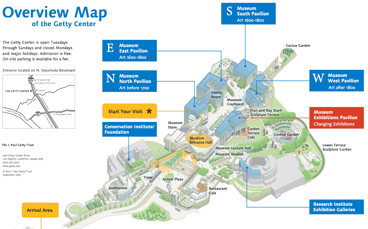
The Getty Center in Los Angeles serves as an exemplary model for effective wayfinding in a sprawling museum complex. It features an intuitive navigation system with well-placed, minimalist signage that complements its modern architecture. The strategic placement of signs at major intersections reduces confusion, and the signage design aligns seamlessly with the museum's aesthetic. An interactive mobile app provides turn-by-turn navigation and exhibit information, enhancing the visitor experience. However, the minimalist approach to signage can sometimes be too understated, causing minor disorientation. Additionally, visitors with access to the app may find navigation less intuitive, highlighting a reliance on technology that may only accommodate some guests.
SFMOMA
SFMOMA in San Francisco excels in visitor navigation through innovative design and accessibility. The museum organizes its galleries using color-coded zones, making navigation straightforward. Both physical maps and a digital interactive version are available, catering to all visitor preferences. SFMOMA prioritizes inclusivity with ADA-compliant signage and services for visually impaired guests, ensuring an inclusive experience. Despite these strengths, high visitor numbers during peak times can lead to congestion in certain areas, which can compromise the clarity of wayfinding, particularly near elevators and escalators.
The Louvre
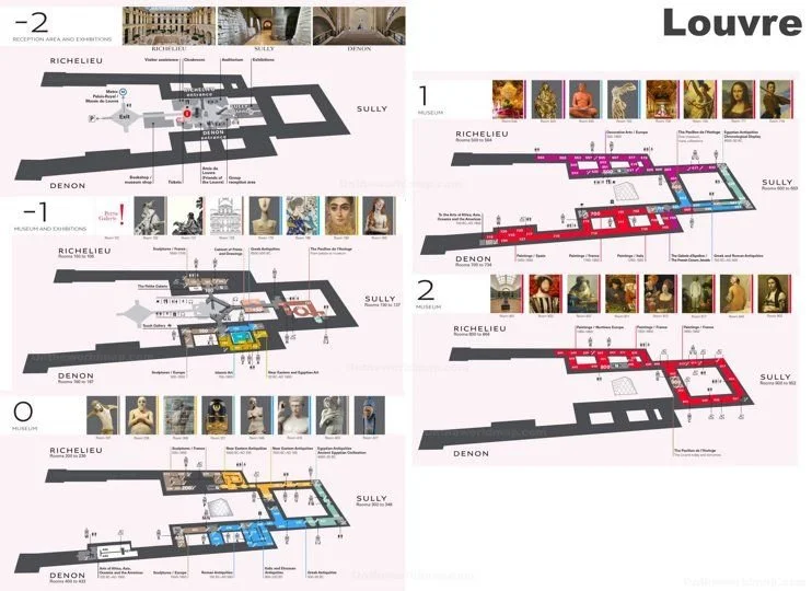
Despite its fame, the Louvre in Paris faces significant wayfinding challenges due to its vast size and complex layout. While the museum provides multilingual signage to assist its diverse international audience and enjoys iconic status that draws visitors worldwide, guests often feel overwhelmed and lost within the extensive galleries. Inconsistent and outdated signs lead to frustration, and the mobile app offered by the museum is often criticized for being clunky and unreliable, hindering its usefulness for navigation. These issues highlight the importance of a cohesive and user-friendly wayfinding system in enhancing the visitor experience.
de Young Museum
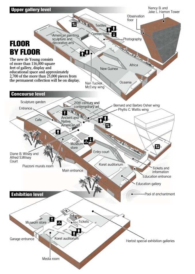
The de Young Museum in San Francisco offers valuable insights into effective wayfinding within a culturally rich environment. With well-designed signs placed in logical locations, visitors are guided efficiently through the space. The signage complements the museum's distinctive architecture, integrating seamlessly with the environment. The museum focuses on accessibility, offering ADA-compliant features, elevators, ramps, and a user-friendly mobile app to enhance the visitor experience. Challenges include an over-reliance on natural light, which can cause glare and make signage difficult to read, and crowded exhibits during peak hours affecting the flow of visitors and the effectiveness of wayfinding.
Vision
Our concept centers on enhancing the wayfinding and informational signage at the Legion of Honor to create a more intuitive and engaging visitor experience. We aim to address the current shortcomings in signage placement, clarity, and branding, developing solutions that guide visitors seamlessly through the museum’s exhibits while reinforcing its visual identity.
To achieve this, we will focus on improving space utilization, refining information signage, and integrating cohesive brand concepts throughout the museum. Our goal is to craft a wayfinding system that not only directs visitors efficiently but also enriches their connection to the museum’s art and heritage.
Pros
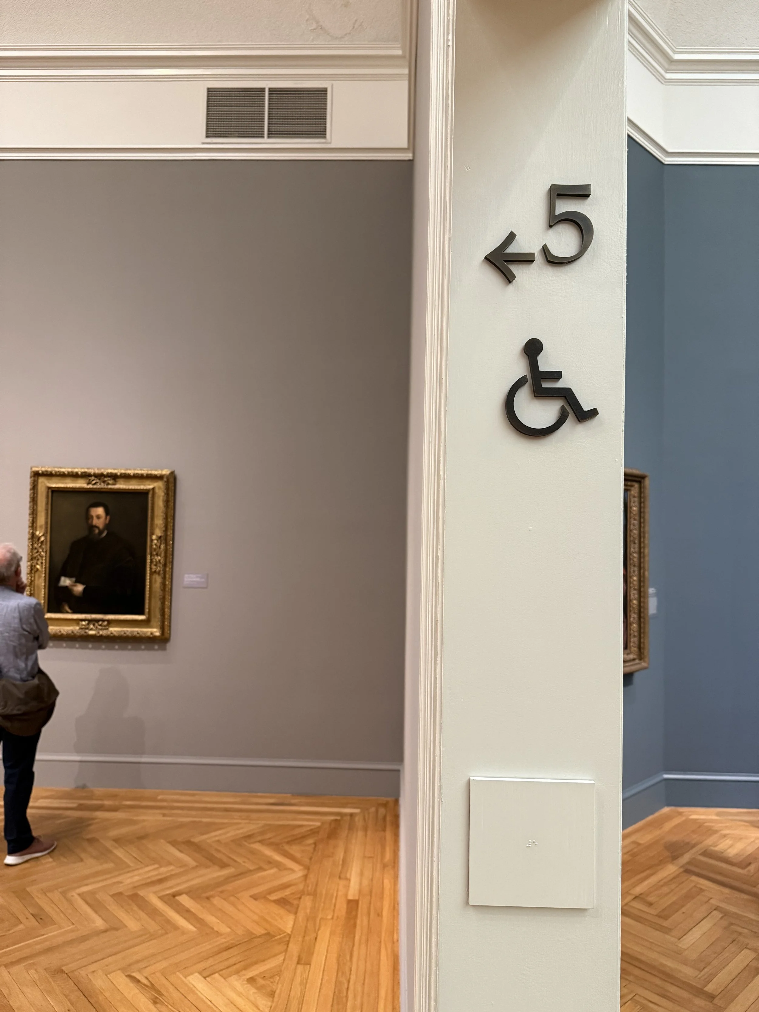
Accessibility Features. The museum includes Braille and tactile elements within its signage, making information accessible to visitors with visual impairments. This commitment to inclusivity ensures that all visitors, regardless of ability, can fully engage with the museum’s exhibits.
Detailed Maps and Guides. Comprehensive maps and guides are provided at various points throughout the museum, helping visitors orient themselves. These tools include easy-to-read layouts, indicating exhibit locations, facility amenities, and accessible routes, creating a smoother visitor experience.
Clear and Informative Signage. Each exhibit is accompanied by well-designed informational signs that provide context without overwhelming the visitor. This balance between informative content and visual simplicity keeps the focus on the artwork while enhancing educational value.
Guided Pathways for Improved Flow. Thoughtfully positioned directional signs guide visitors along recommended pathways, reducing congestion in popular areas and enhancing the overall flow through the museum.
Cons
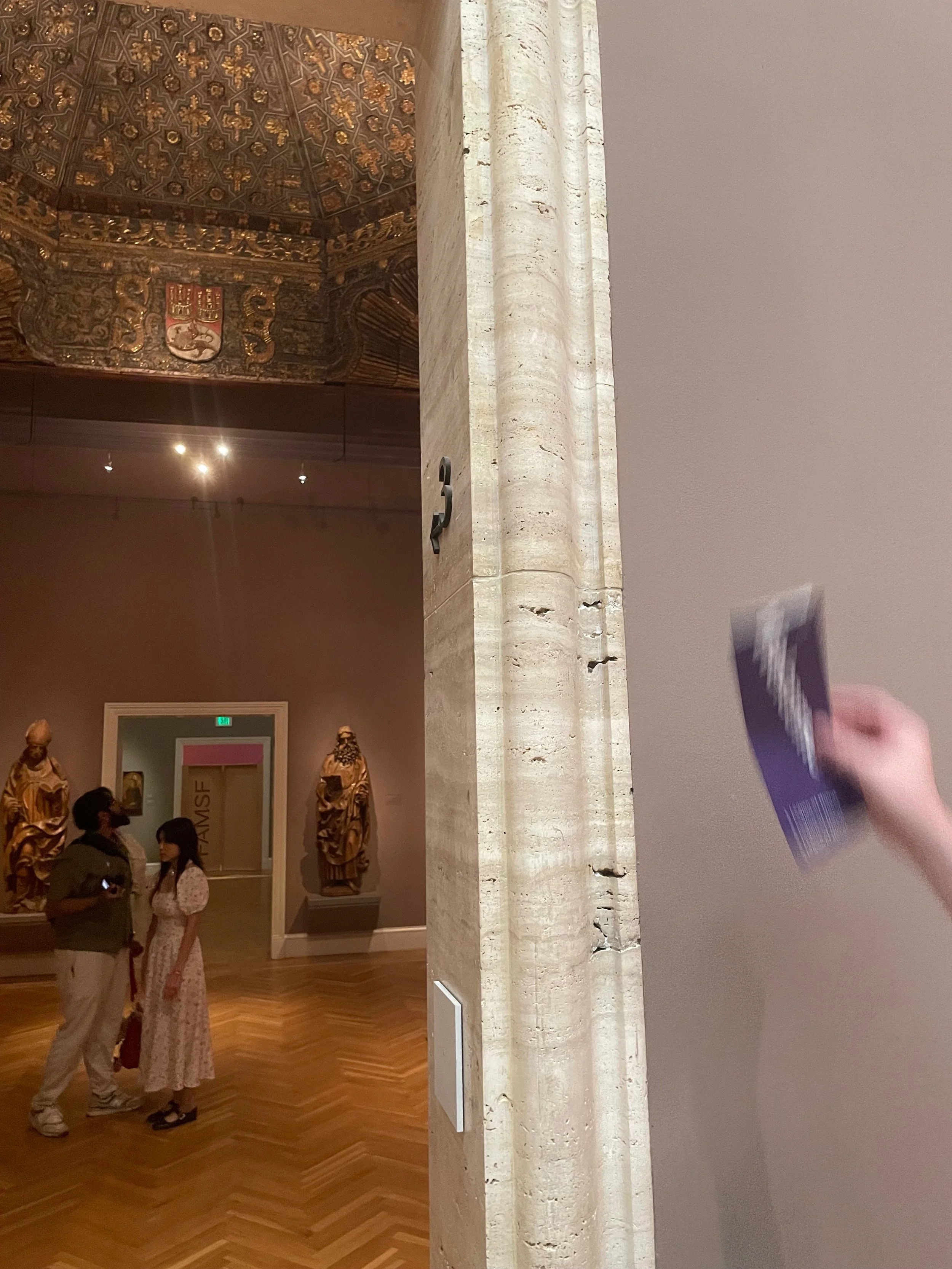
High Placement of Room Numbers. Room numbers are positioned too high within door frames, making them difficult to locate for all visitors, particularly those who may be shorter in height or have visual impairments. Lower placement could improve visibility.
Inconsistent Numbering System. The room numbering system lacks a clear logic, leading to confusion among visitors who rely on these numbers to navigate between exhibits and locations. Establishing a more intuitive system would enhance orientation.
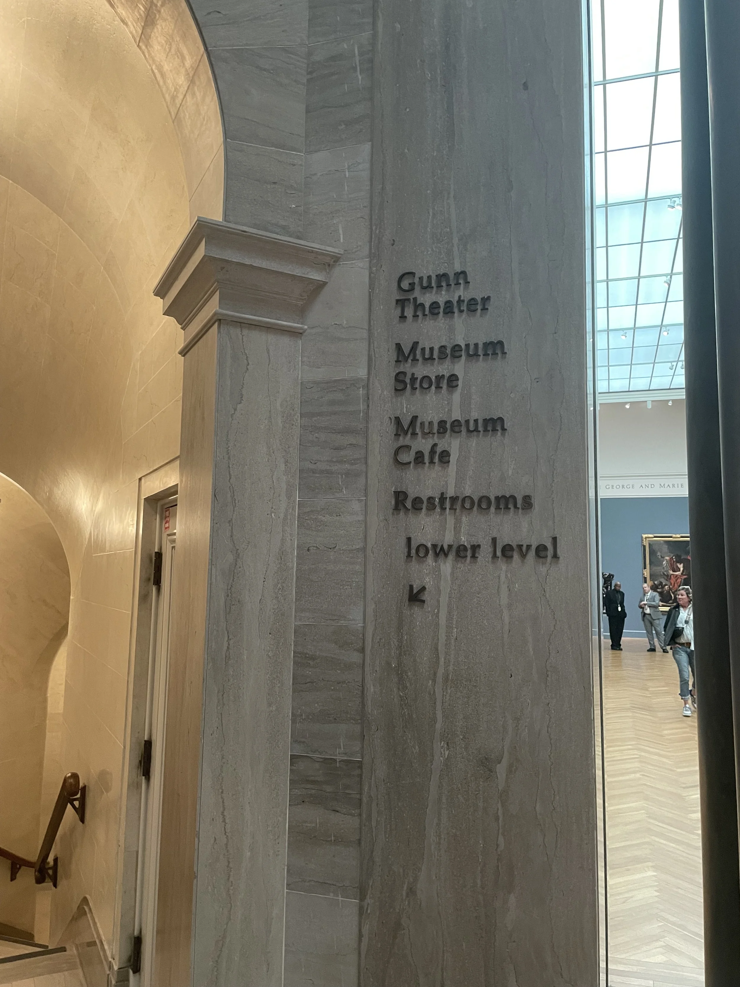
Lack of Signage Guidance. Some signs do not adequately guide visitors toward key museum areas, such as restrooms or exits. This can lead to unnecessary detours and frustration, especially for those unfamiliar with the museum layout.
Absence of Brand Consistency. The current signage system lacks cohesive brand language and design guidelines. This inconsistency diminishes the overall professional appearance and may affect the museum’s ability to leave a lasting impression on visitors.
Overuse of Redundant Signage. Certain signs within the museum are redundant, creating visual clutter without adding value. A more strategic placement could streamline the environment and allow for a more visually appealing space.
Limited Hierarchical Structure in Informational Plaques. Informative plaques are not organized with a clear visual hierarchy, which can overwhelm or confuse visitors. Incorporating typographic or layout hierarchy would help visitors quickly locate and process essential information.
Analysis
Our analysis of the current signage system highlights opportunities to enhance accessibility, navigability, and brand consistency throughout the museum. While existing elements like Braille signage and available maps support accessibility, there’s room for improvement with more tactile elements and audio guidance. Enhancing exhibit signage with clear visual hierarchies and repositioning room numbers at eye level will streamline navigation and allow visitors to locate information quickly. Additionally, implementing strategically placed directional signs with universal symbols will guide visitors more effectively through the museum.
We also recommend developing a cohesive brand language across all signage to strengthen the museum’s identity, reducing redundant signage to minimize visual clutter, and introducing structured informational plaques with icons distinguishing artwork types. By unifying design elements and improving hierarchy in informational displays, these adjustments will create a more intuitive and visually appealing experience, helping visitors engage seamlessly with the museum’s spaces and exhibits.
Logo Concept
The initial logo concept draws inspiration from the neoclassical architecture of the Legion of Honor’s historic facade. The design harmoniously integrates elements of classical columns and arches, representing the grandeur of the building while also embodying the museum’s rich heritage.
The logo combines the letters “L” and “H” to form a unified symbol, where the “L” echoes the structure of a column, and the “H” features an arch-like form. This integration of architectural motifs reinforces a sense of timeless elegance and aligns with the museum’s identity as a preserver of fine art and culture. Each element is crafted to reflect strength and balance, echoing the institution’s commitment to both historical integrity and modern appeal.
This design approach supports various color adaptations to ensure versatility across digital and print platforms. The selected color palette is inspired by the natural tones of the museum’s surroundings and classical materials, grounding the logo in a palette that is both understated and timeless.
These variations enhance the logo’s adaptability, maintaining its distinct identity across different media while echoing the museum’s mission of preserving artistry through the ages. The chosen serif typeface adds sophistication, complementing the neoclassical aesthetic. Through clear lines and minimalistic elements, the logo achieves a seamless blend of tradition and modernity, reflecting the museum’s role as a bridge between the past and present in art and design.
Color Palette
The Legion of Honor’s color palette reflects both the neoclassical architecture of the building and its diverse art collections. A well-chosen color scheme brings cohesion to the museum’s signage, wayfinding, and branding.
Primary Colors:
A muted, elegant palette inspired by the museum’s architecture consists of tones like olive green, soft beige, and deep black. These colors are used across physical signage and digital applications to ensure a cohesive experience for visitors.
Accent Colors:
Accent colors are applied to differentiate museum sections.
The chosen colors create a harmonious balance between the classical and modern elements of the museum’s identity.
Brandmark
This brandmark is inspired by the neoclassical architectural elements of the Legion of Honor, particularly the iconic façade and its structural shapes. The design emphasizes balance, structure, and timeless elegance, capturing the essence of the museum’s identity.
It will serve as a versatile visual element across all brand communications, including signage, merchandise, and digital collateral, ensuring consistency in the museum’s branding. The brandmark’s simplicity and distinctiveness make it easily recognizable, supporting both physical and digital experiences.
Typography
We selected Manrope, a variable sans-serif font, to complement the classical serif logo and bring a modern touch to the museum’s identity.
Designed by Mikhail Sharanda in 2018, Manrope is known for its clean lines and high readability, making it ideal for both print and digital applications, including signage and wayfinding.
The font’s versatility across various weights ensures consistency and clarity, contributing to the museum’s modern and approachable visual system.
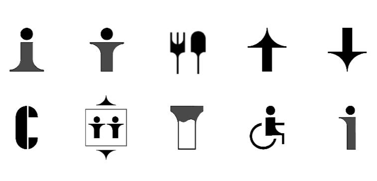
A successful pictogram system must be simple, recognizable, and consistent with the museum’s design language. This minimalist approach to pictogram design draws inspiration from the museum’s neoclassical style and architectural heritage, ensuring coherence with the broader visual identity.
Design Style:
The updated pictograms are based on bold, geometric forms derived from neoclassical details, such as the sculptures and architectural features of the museum. The symbols are clear, functional, and maintain an elegant aesthetic while being universally recognizable and easy to interpret for visitors of all backgrounds.
Color and Format:
A muted color palette of bronze and black is applied to these pictograms, aligning with the museum’s branding. These designs focus on clarity and contrast, ensuring that symbols for restrooms, information points, cafes, and exits are immediately identifiable. The use of a grid-based layout ensures uniformity and simplicity, contributing to an intuitive wayfinding system.
Museum Map
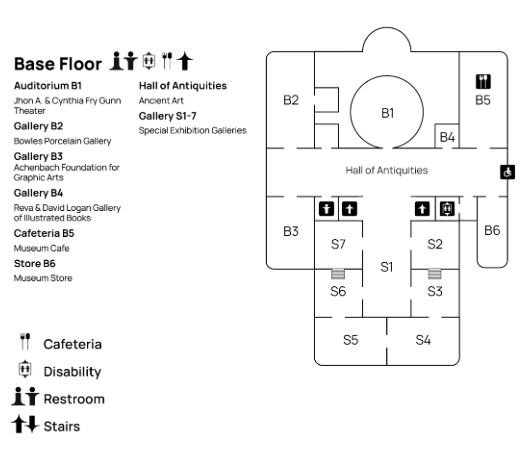
The museum map introduces a Left/Right numbering system that guides visitors through the galleries with ease. Locations are designated with “L” for galleries on the left and “R” for galleries on the right, corresponding to their relative position from the main entrance and central pathways. This system helps visitors quickly orient themselves and navigate through the space.
Secondary Kiosks
In addition to the main kiosk located in the Tickets and Membership room, a network of smaller kiosks will be strategically placed throughout the museum. These secondary kiosks provide visitors with easy access to interactive maps and exhibit information, ensuring continuous wayfinding support as they explore the galleries.
Each kiosk will feature clear, accessible touch screens displaying key highlights, current exhibitions, and suggested routes. With a focus on enhancing visitor engagement and orientation, these kiosks act as reference points to guide guests seamlessly from one section of the museum to another. Their placement is optimized to reduce visitor confusion, particularly at gallery intersections and major exhibit areas.
The kiosk features a clear, interactive display, providing detailed maps, and exhibit highlights. With a screen size optimized for readability and user engagement, the kiosk serves as the primary point of reference for navigating the museum. Its strategic placement, clear typography, and incorporation of digital interaction elements ensure visitors can orient themselves with ease, offering a seamless flow through the galleries and other facilities.
Third-level Signage
The third-level signage system will now feature the museum’s brandmark integrated directly into the wall design. This approach removes the need for separate exhibit signs, streamlining the aesthetic and reducing visual clutter within the gallery space.
Textual information about individual artworks, collections, and thematic galleries will be displayed directly on the walls in a minimalist and elegant format. Key details such as the title, artist, date, and a brief description, are organized to maintain the cohesive neoclassical design of the museum. This integration ensures that visitors receive essential contextual information in a way that complements the visual harmony of each gallery.
Main Kiosk
The primary signage system is essential for guiding visitors through the museum, placed at key entry points and central areas. These signs immediately direct visitors to major exhibitions, restrooms, and exits while maintaining a consistent design language inspired by the building’s neoclassical architecture.
The main kiosk, now located in the Tickets and Membership room, which is the first room upon entering through the Court of Honor, serves as a hub for visitor information. Designed with ADA-compliance in mind, the kiosk ensures that interactive elements are positioned between 15 to 48 inches from the floor, accommodating users with different mobility needs, including wheelchair users. The touch screen and interactive components are accessible within these height ranges, allowing for comfortable use by all visitors.
Second-level Signage
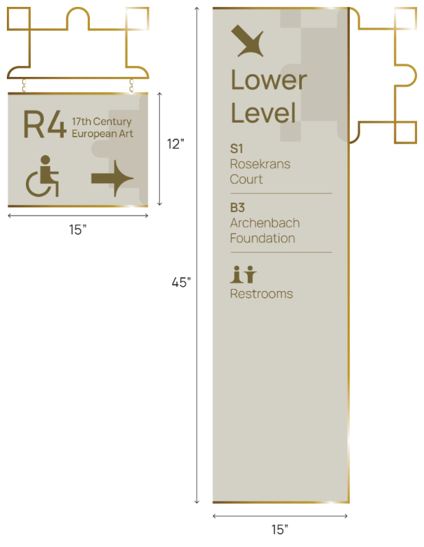
The second-level signage system is designed to guide visitors to specific locations within the museum, such as individual galleries, special exhibits, and key facilities like restrooms and stairways. These signs feature a clear typographic hierarchy and high contrast to ensure readability from a distance, even in low lighting.
Each sign includes icons to denote accessibility and directional cues, helping visitors easily locate destinations. Additionally, the refined neoclassical style aligns with the museum’s branding, blending functionality with aesthetic consistency across all spaces.
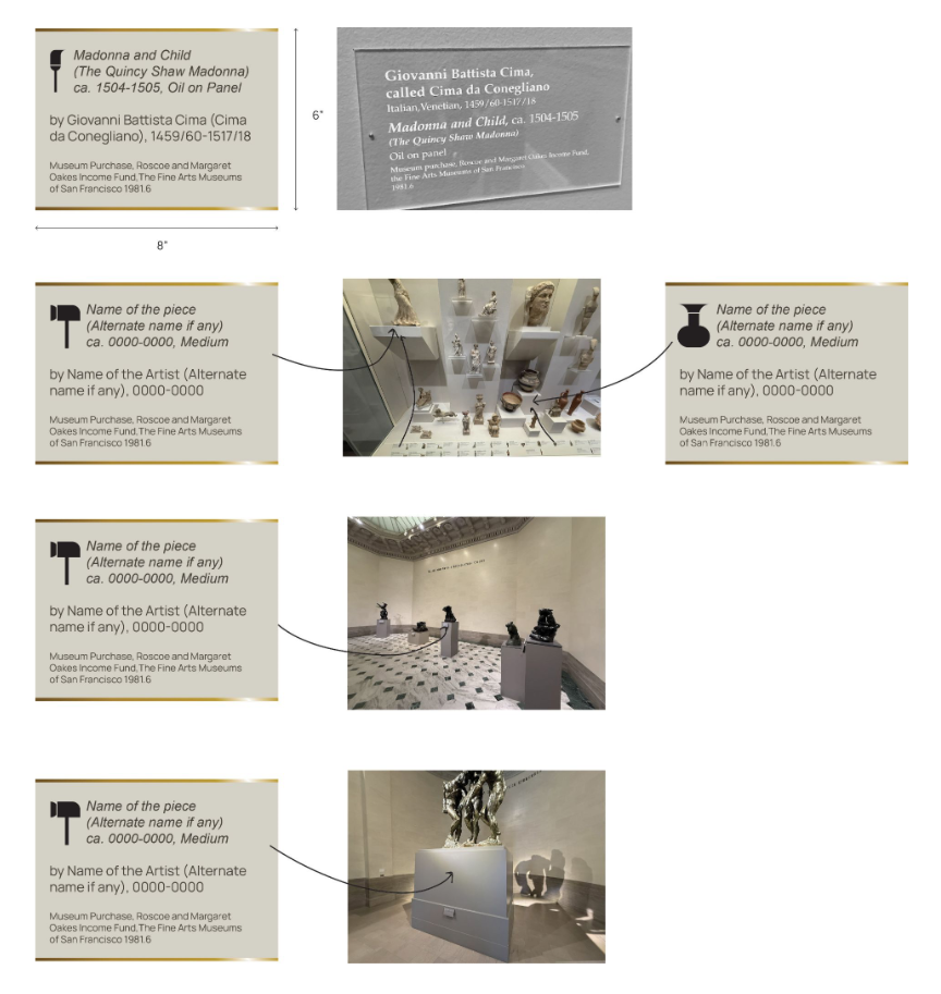
The third-level signage is strategically designed to maintain the visual integrity of the museum’s galleries while providing essential information about individual artworks and collections. Each sign features a clean, minimalist layout, ensuring readability without distracting from the surrounding art.
Material and Dimensions:
Crafted to complement the museum’s neoclassical aesthetic, these signs use neutral tones and high-contrast text, ensuring accessibility for all visitors. Standard dimensions, such as 6” x 8” or 8” x 10”, have been chosen for easy readability while maintaining a discreet presence.
Information Hierarchy and Iconography:
The content hierarchy is carefully structured to highlight the artwork’s title, artist, date, and medium, followed by a brief contextual description. Each sign also includes a small icon at the top to visually distinguish between different types of artworks—paintings, sculptures, decorative arts, and more. These icons provide a quick visual reference for visitors, enhancing their navigation through various exhibits and enabling a more intuitive exploration of the museum’s diverse collections.
Placement and Viewing Angle:
Positioned at an accessible viewing height, each sign is angled for easy reading without obstructing sightlines to the artwork. This arrangement ensures that visitors can engage with the pieces while seamlessly accessing relevant information, enhancing both the educational and aesthetic experience.

This section brings together the entire wayfinding and signage system, illustrating how each component creates a cohesive visitor experience throughout the museum. The integration of the primary information kiosk, secondary directional signs, and tertiary exhibit markers ensures that visitors receive clear guidance at every step, from initial orientation to detailed exhibit information.
Each element serves a unique purpose yet contributes to a unified flow, aligning with the museum’s aesthetic and accessibility standards. Thoughtful placement and consistent visual language make it easy for visitors to navigate intuitively, moving effortlessly between galleries and points of interest while engaging with the exhibits and spaces around them. This comprehensive approach to wayfinding enhances both the functionality and the elegance of the museum experience, supporting a seamless journey from entry to exploration.
As our visitor steps into the Tickets and Membership room, the first area they encounter after walking through the Court of Honor, they are immediately drawn to the new kiosk. The clear, interactive display provides detailed maps, key exhibit highlights, and real-time information about the museum’s features.
They use the kiosk to orient themselves, reviewing their options for exploration. The kiosk’s interactive display allows them to quickly locate French and Italian Baroque art, and they select that as their first destination.
After interacting with the kiosk, the visitor walks into the Rotunda, where new, well-placed signage directs them. Signs guide visitors to several main galleries and facilities. Following the signage, they decide to take a left (L1-L8), guided by the clear numbers and wayfinding symbols.
The visitor now heads toward the French and Italian Baroque and Rococo Art galleries, feeling confident in the intuitive flow of the space.
Arriving in the French and Italian Baroque and Rococo galleries, the visitor immerses themselves in the rich cultural history. After spending time here, they follow the signage to explore the Auguste Rodin Sculpture galleries (SL, SC, SR), another hallmark of the museum.
Each gallery features easily identifiable exhibit signs, blending seamlessly with the aesthetic while providing contextual information about the artwork. These small exhibit signs are also enhanced by the brandmark and are directly on the wall for a clean and cohesive look.
The visitor returns to the Rotunda to access the stairs leading down to the basement level, where the restrooms and museum café are located. This central hub serves as the main transition point, guiding them effortlessly to essential amenities. The signage in the Rotunda provides clear directions, ensuring they can navigate easily between floors and maintain a cohesive flow throughout their visit.
After a brief stop at the café and restrooms on the basement level, the visitor ascends the stairs, returning to the Rotunda once more. From here, the intuitive signage guides them toward the main exit, providing a seamless conclusion to their museum experience. The visitor leaves feeling oriented and well-accommodated, having effortlessly navigated through the museum’s thoughtful wayfinding system.
CREDITS
Design Team
Sanika Barawkar
Tso Ming Shih
Michael Chaves
Project Coordinator
Chang Sik Kim
Master of Design, Experience Design
San Jose State University


